Pink’s Studio
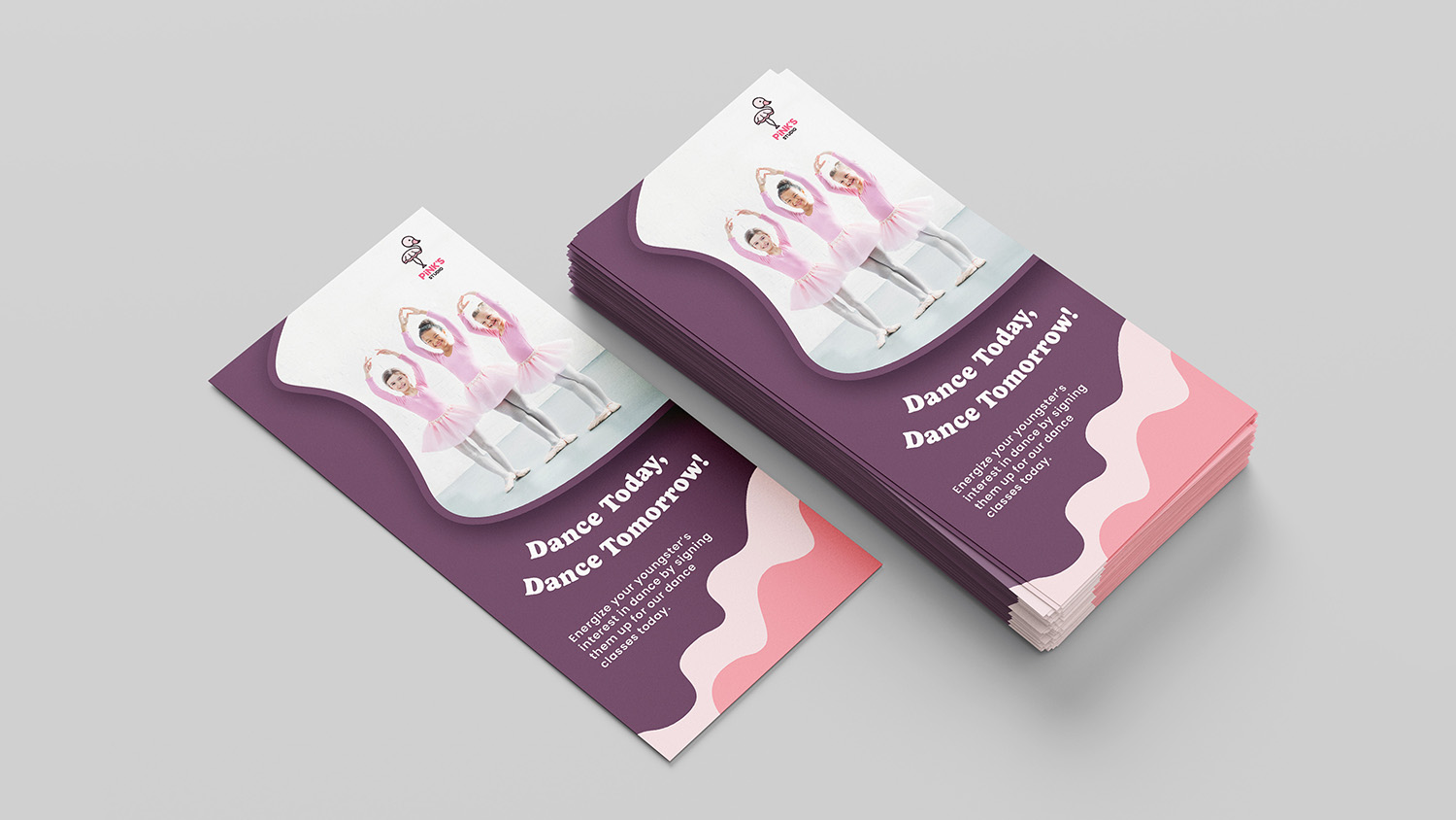
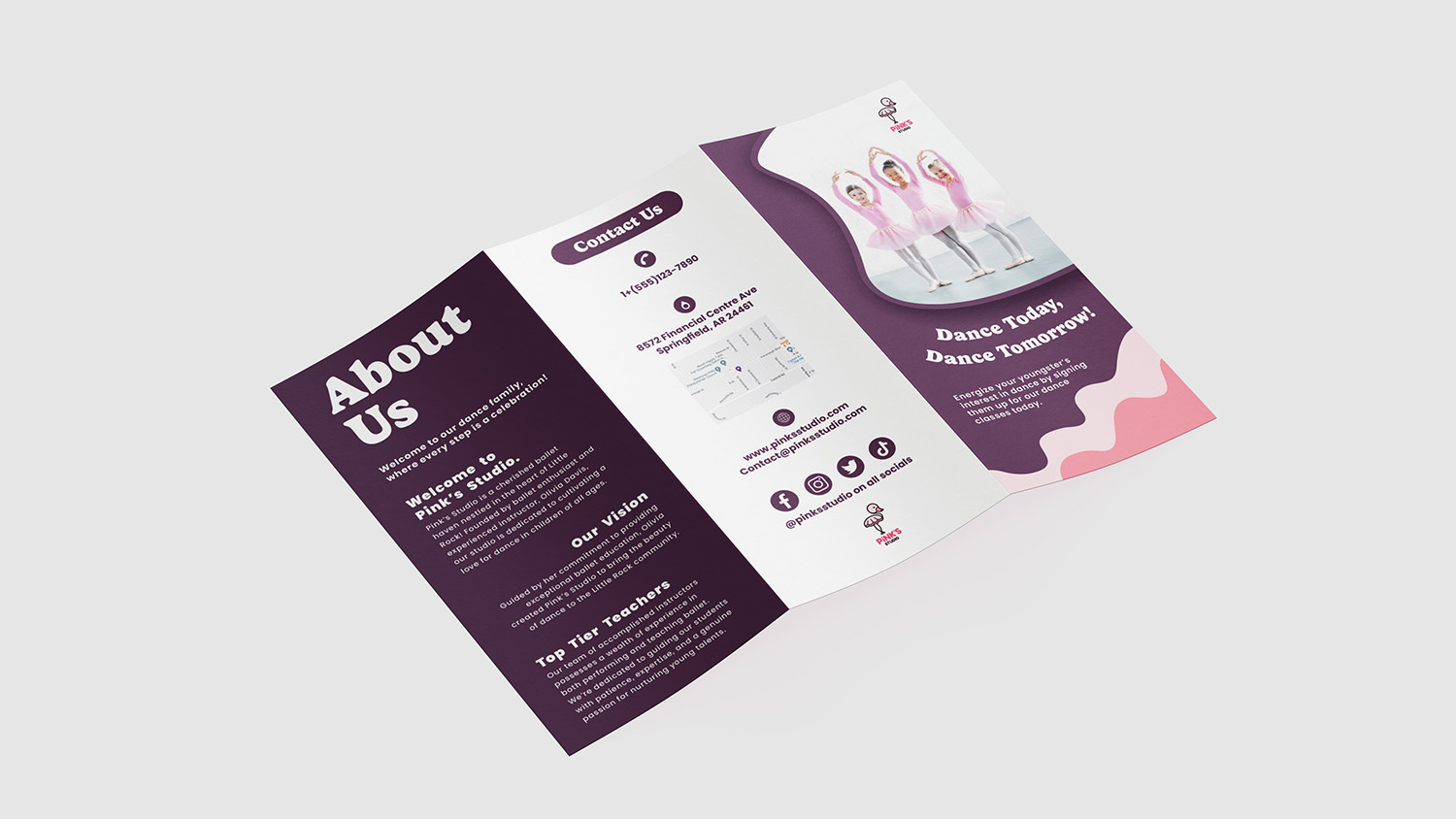
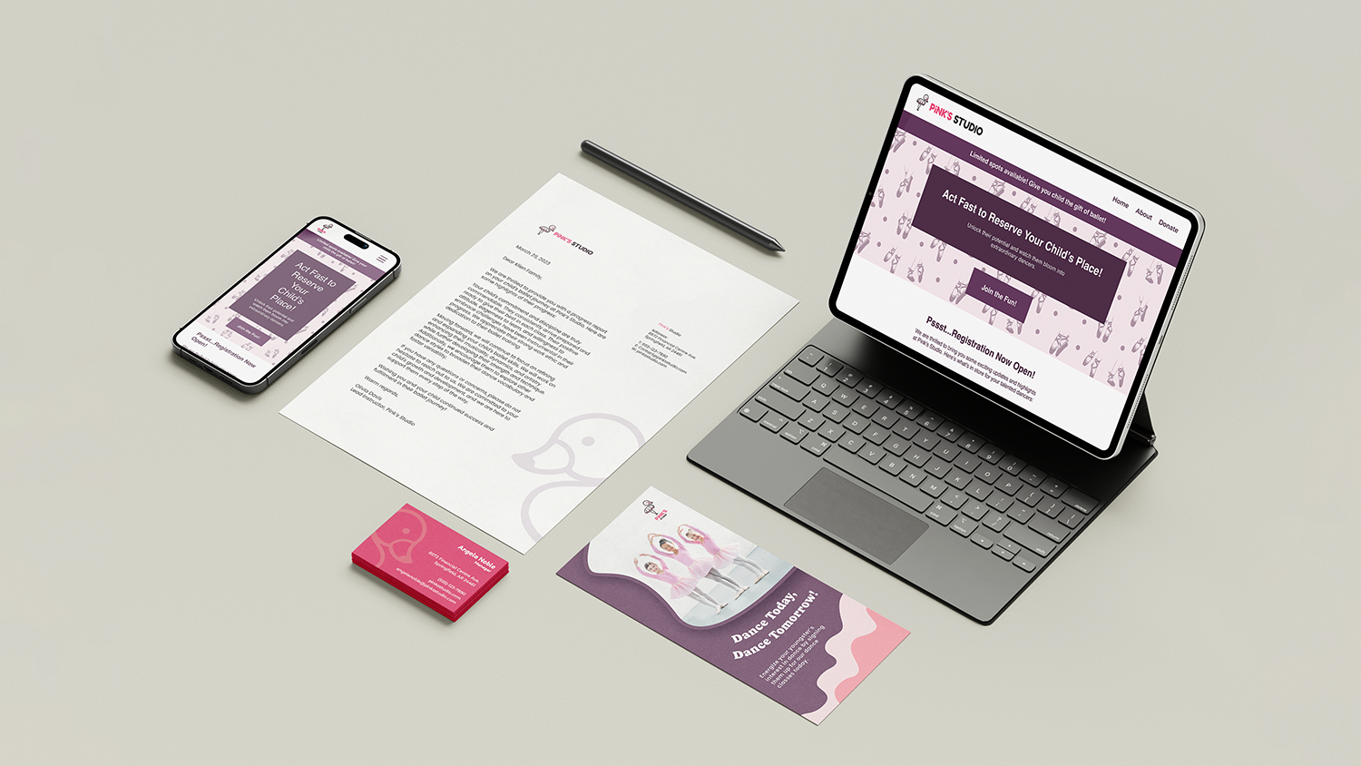
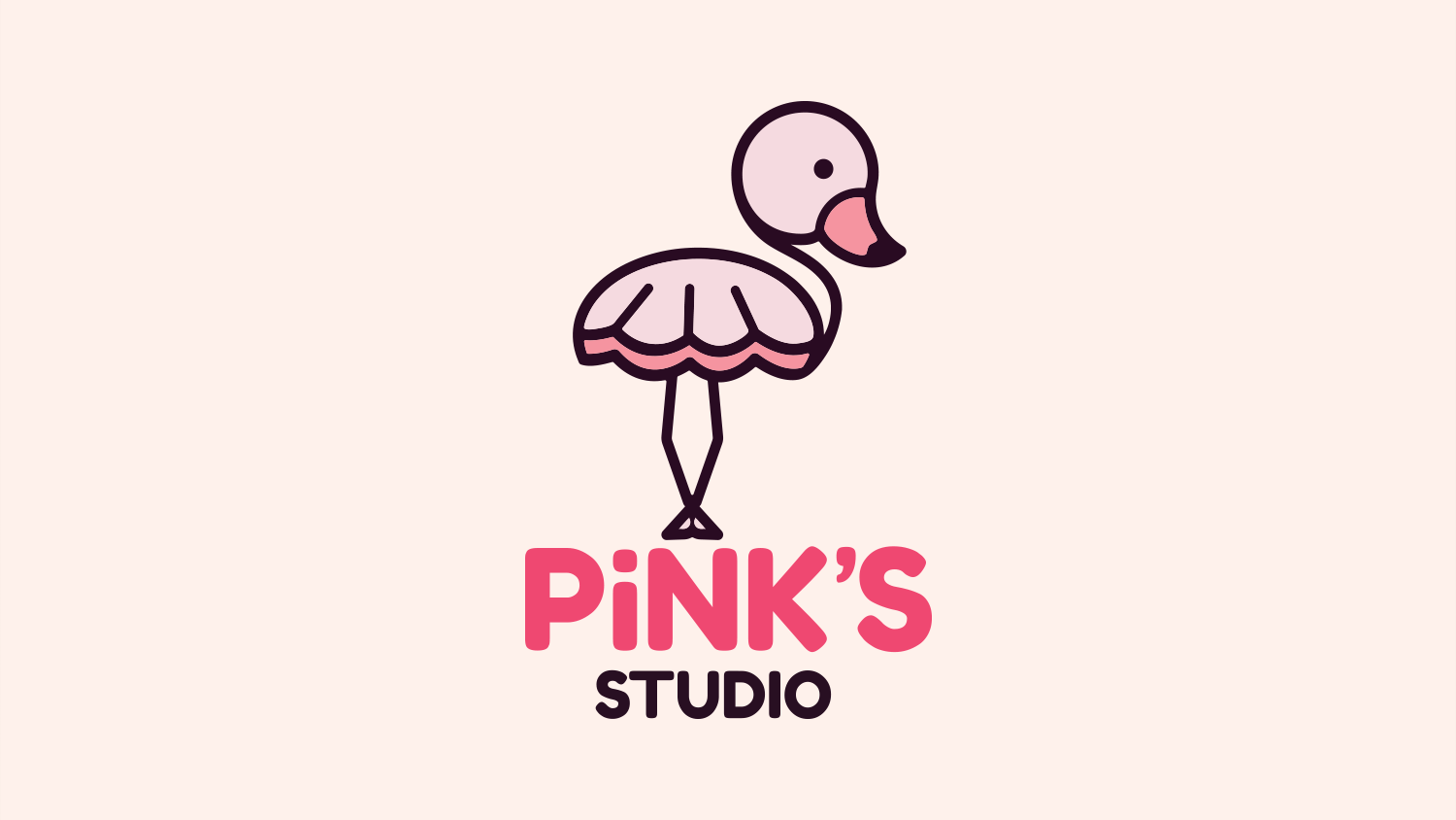
Pink’s Studio is a ballet studio for children ages 3 to 8 located in the suburbs of a major city. Their goal is to have a contemporary animal logo that reflects the service they provide. In addition, they want their branding to look affordable yet chic.
Year: 2022
Software: Adobe Illustrator, Adobe InDesign, Adobe Photoshop
Case Study: Brand Identity, Print / Digital Marketing & Advertising
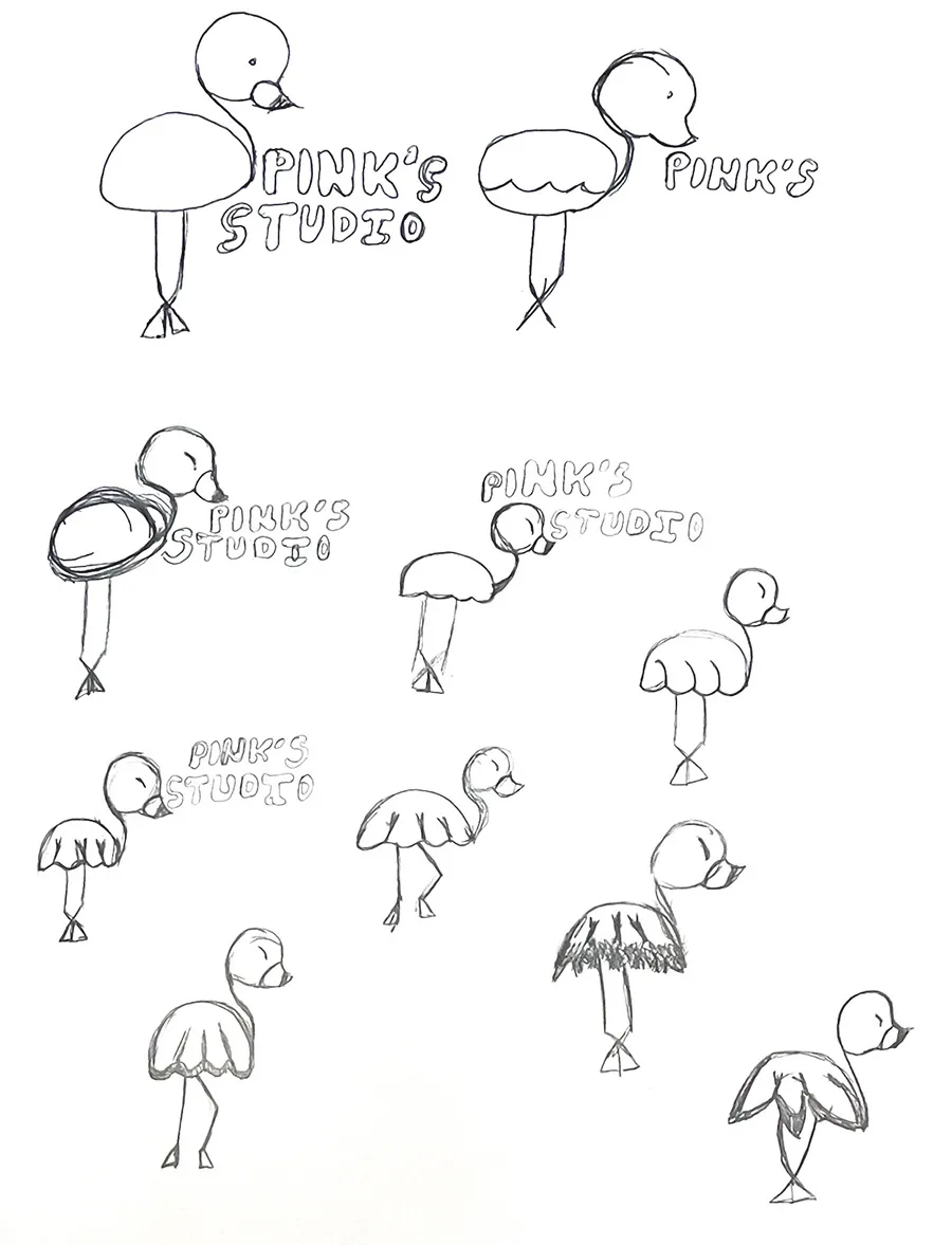
Sketches
Thought Process
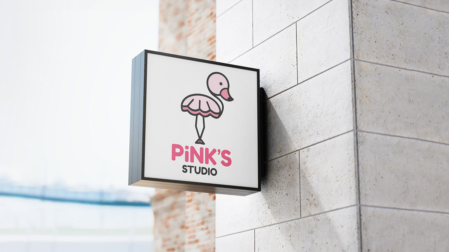
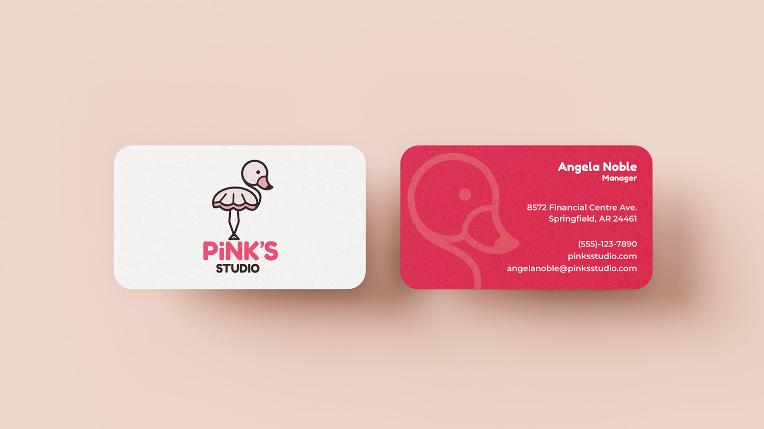
The flamingo is a perfect mascot for a ballet studio that promotes balance and grace. Pink is typically associated with ballet and keeping the overall design clean and sleek pushes it in the right direction of the class.
There is also a clever element of the flamingo wearing the traditional tutu for added flair.
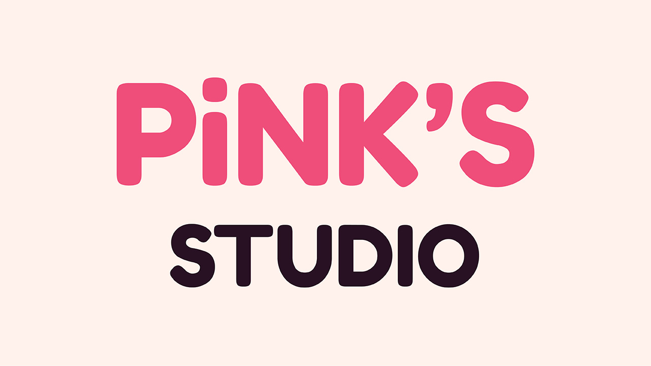
In addition, the typeface needed to be bold but decorative enough to show a playful atmosphere.
Finally, the choice to have a lowercase i in the title represents the idea of being a business for the little ones.
