
Maker Publication
Maker is a publication catering to cosmopolitan people interested in crafts. Maker’s objective is refining its identity and modernizing its magazine to attract a polished audience. In Maker, I wanted to spin the idea of giving a craft magazine a more sophisticated atmosphere.
Year: 2021
Software: Adobe InDesign
Case Study: Publication Design

About Maker Publication
First, one needs to ask themselves, who is reading this? One can notice a theme catering to an older generation in the craft magazine section. Of course, there is a level of sophistication when reading about art. But what about crafts?
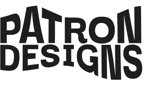
Using a bold typeface for the logo demands focus amongst the other cluttered covers on the newsstand. I used one sans serif typeface and more negative space between headlines. As a result, nothing is over the top, and elements are organized and minimal
The theme continues to the spread page with a straightforward layout, high-quality images, and a focus on typography. All features align with the magazine’s minimalism, sustainability, and quality values making it an enjoyable experience for those who enjoy sleek design.

