Panda Pete’s Polishing Paste
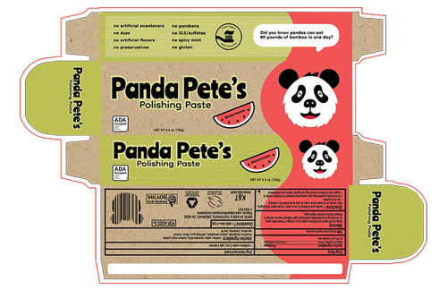
Panda Pete is a company specializing in infant and child health/bath products seeking to add a new toothpaste to its product line. Their goal is to create an original logo mascot, and packaging. The packaging should include an environmental educational element understandable for children aged 2–6. Also, Panda Pete’s seeks to increase sales to environmentally conscious parents.
Year: 2022
Software: Adobe Illustrator
Case Study: Logo / Package Design
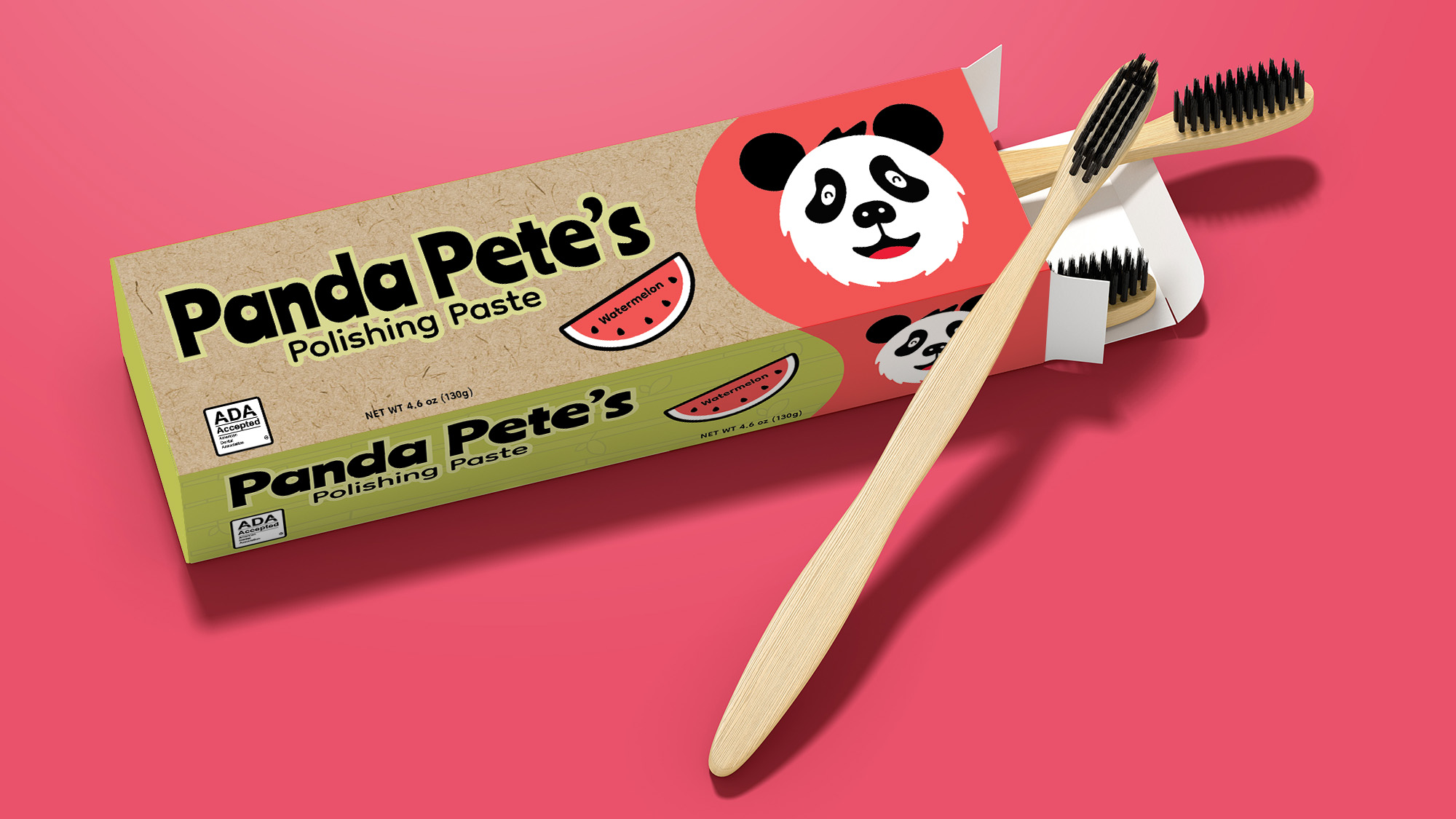
About Panda Pete’s Packaging
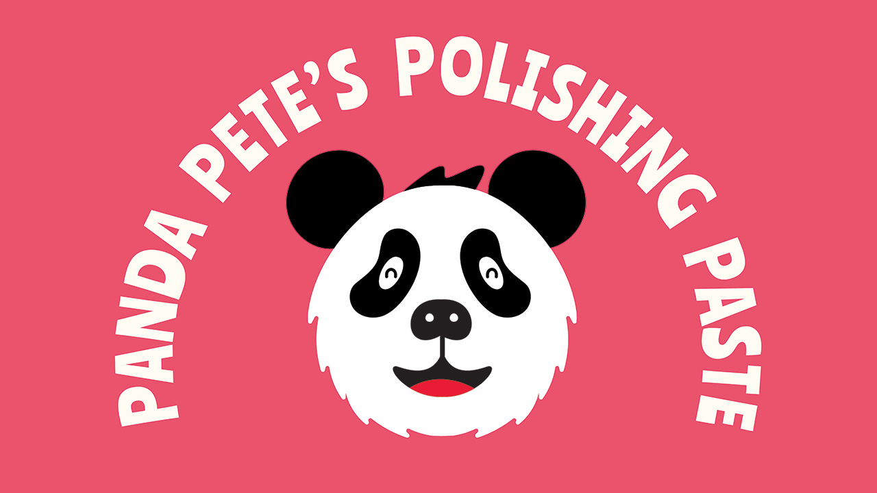
Panda Pete is a giant, friendly panda with a big jolly smile.
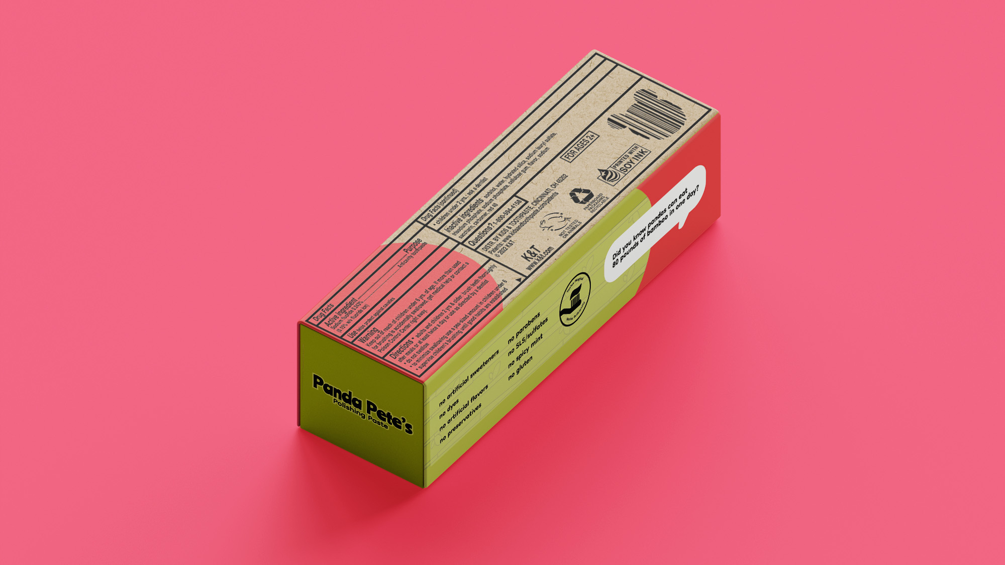
The packaging comprises bright pink and green shapes, colors associated with the flavor. A funky typeface and bamboo illustrations play with the imagination of children and parents alike. The packaging is made of recycled paper and printed with soy ink, making it 100% recyclable.
Along with being environmentally friendly, a fun panda fact can be read and used as an educational tool for parents to introduce their children to eco-friendly brands.
The Process
Moodboard
First, I look at competitors’ styles, list common traits, and think of a twist for our design. Second, charming illustrations add a setting for the mascot to expand his universe. Next, bright colors that signify the flavor will add a focal point against the dull blues and greens that fill the toothpaste aisle.
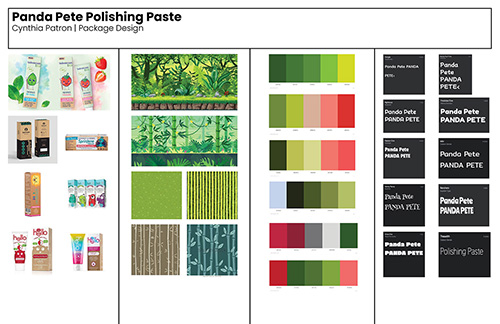

Jot Down Ideas
Sketches
I start every sketch phase by using the basics of shapes. By adding a patch of hair and a jolly smile, kids can see the qualities that they possess in Panda Pete, making him relatable.
Create Package
Vector Elements
Since Panda Pete uses the simplest shapes and vector illustrations, Adobe Illustrator was the best program to put Panda Pete together.
